
2025 ▸ Rebranding Overland Travel
Overland Travel
Overland Travel runs expeditions all over the world, in trucks built for the job. This was a rebrand: before, the logo was just the mountain.
I redrew the mountain and tightened the typography, so the logo holds up at any scale, from a favicon to the side of a truck. The mountain also got a block around it, shaped like a compass. That shape became the foundation of the identity: every icon, symbol and sub-label is built on the same block. It makes the brand easy to recognise and easy to grow, whatever gets added next.
From there it ran into everything: the trucks, caps, jerrycans, stickers, the website and the brandbook.
BrandbookThe pages, built from their own layers
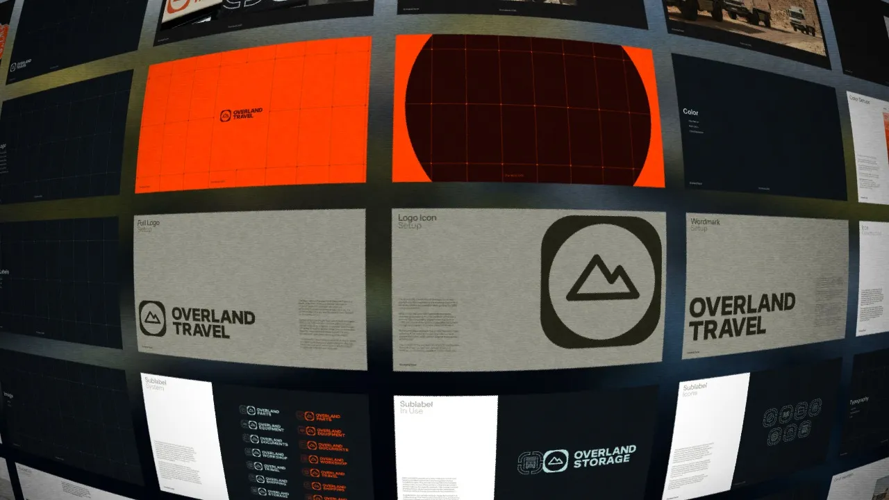
SublabelsOne label, seven departments
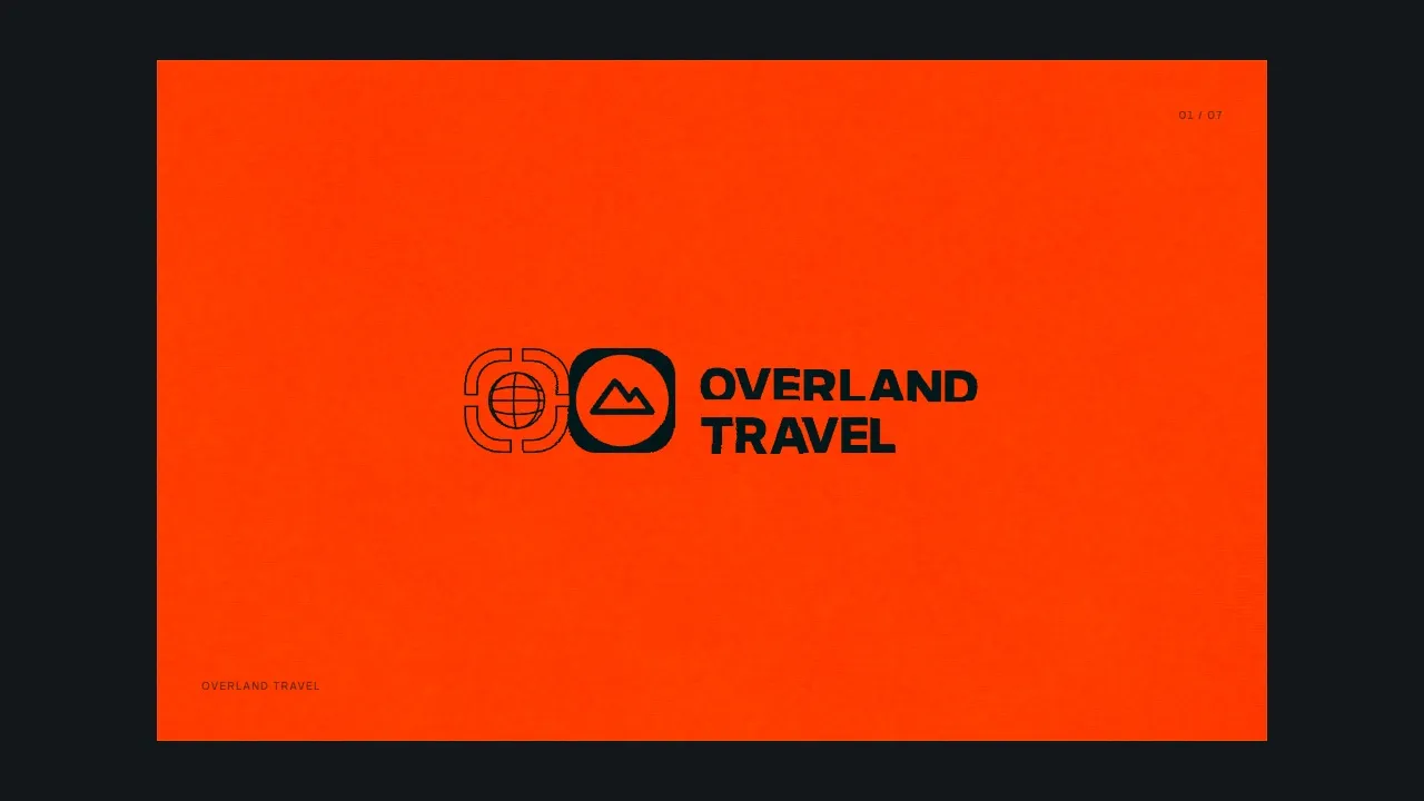
The markBuilt in points
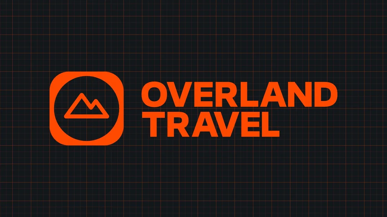
PostThe ground changes, the logo stays


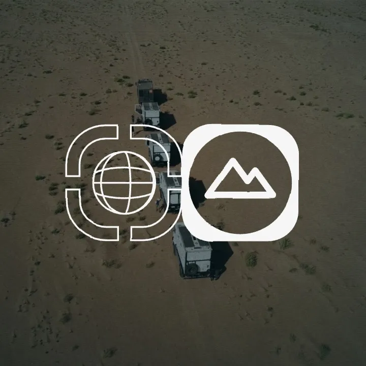
PostOnly the globe turns
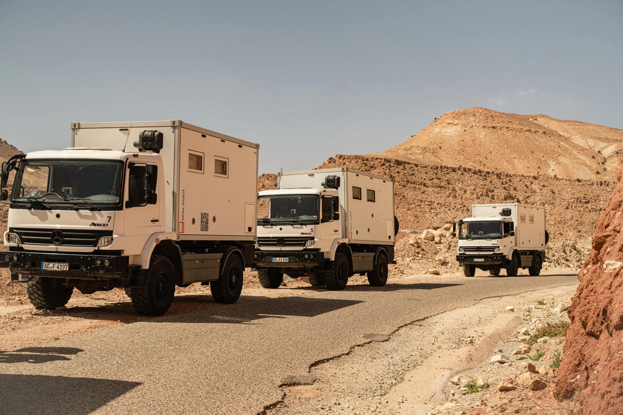
Overland Travel · 2025Three expedition trucks on a desert road
Overland TravelFIG. 01 / 15
Overland Travel · 2025Emblem and wordmark on a truck door
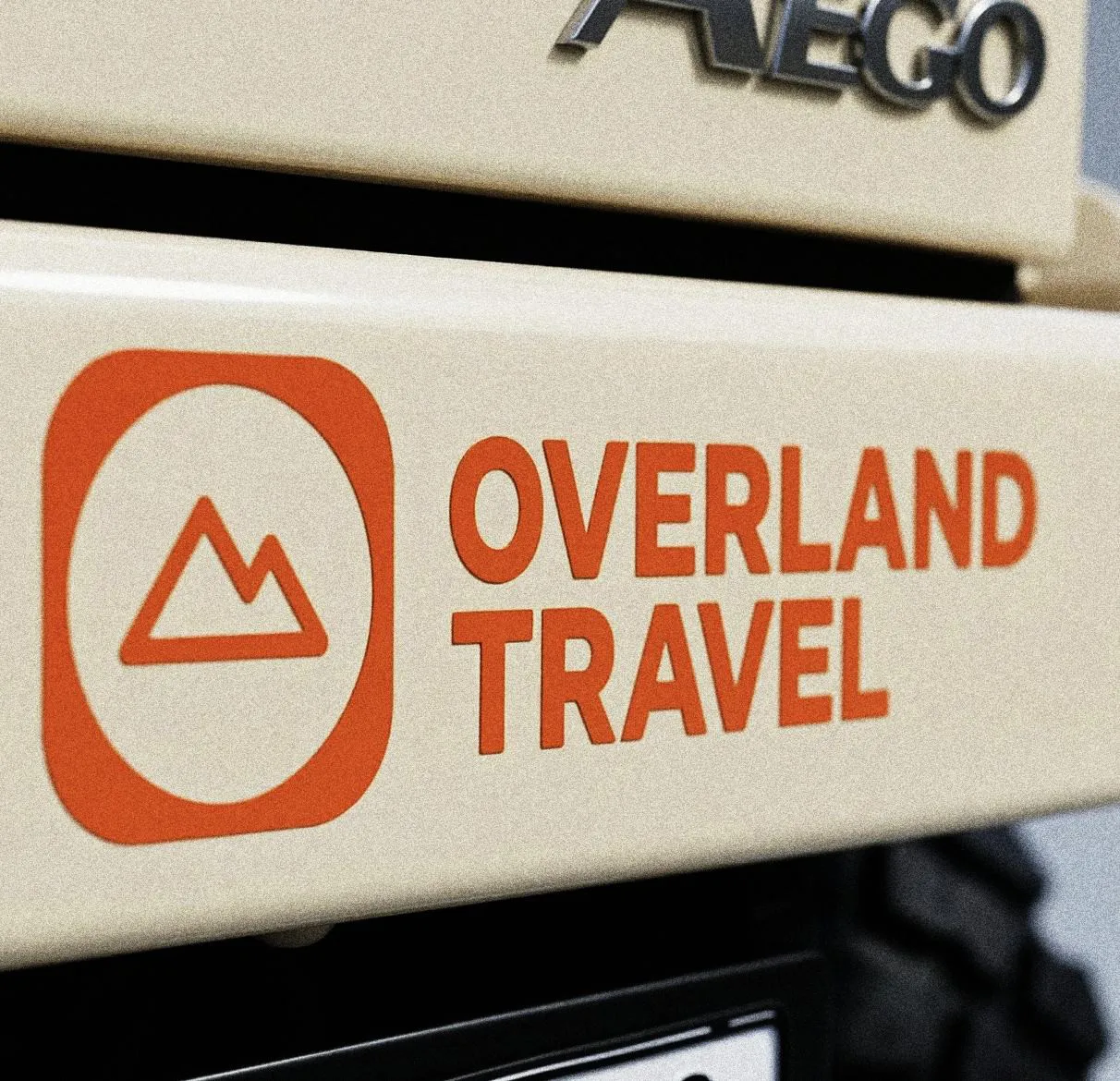
Overland TravelFIG. 02 / 15
Overland Travel · 2025Blue cap on the dashboard
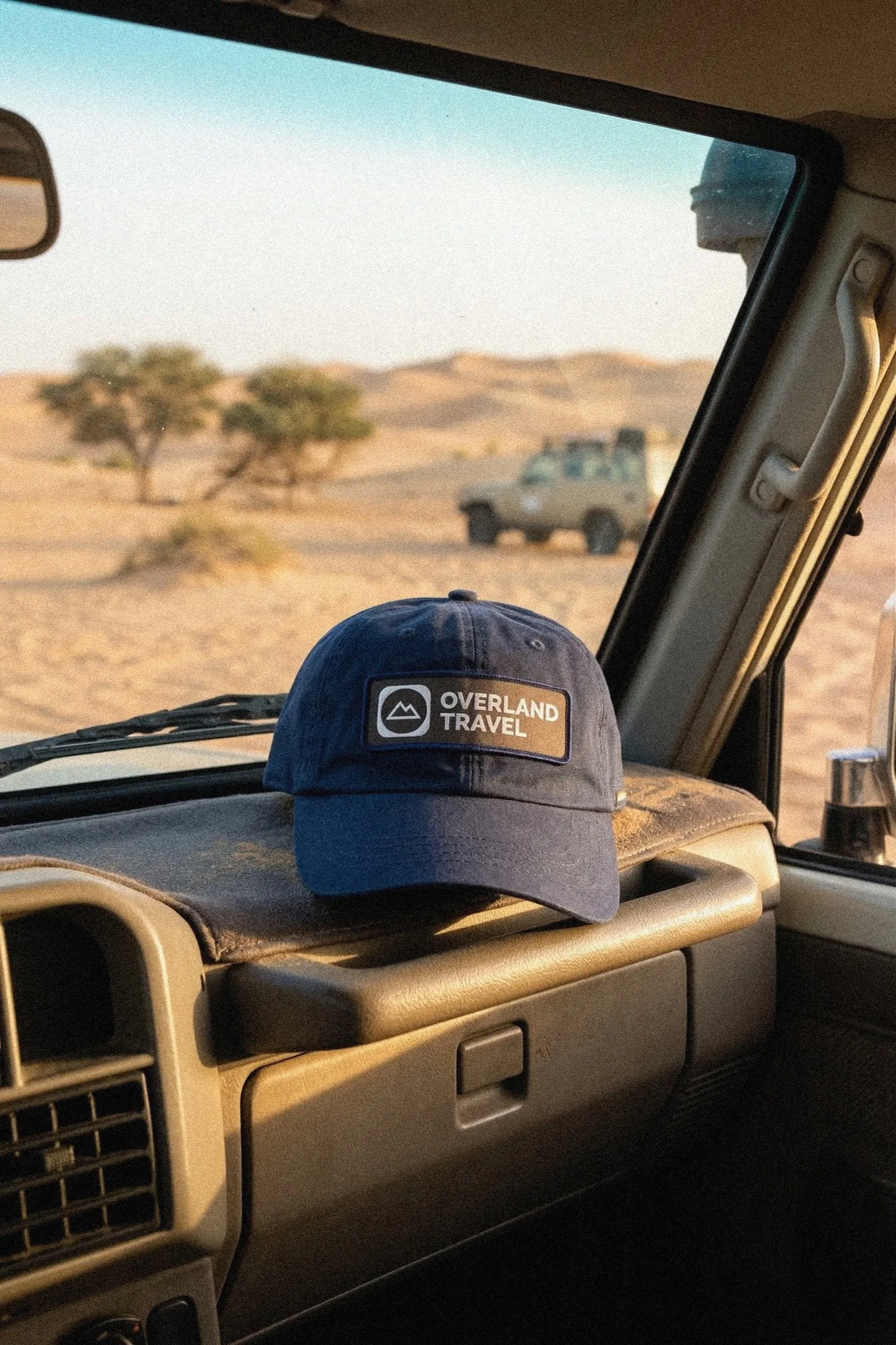
Overland TravelFIG. 03 / 15
Overland Travel · 2025Orange jerrycan with the emblem
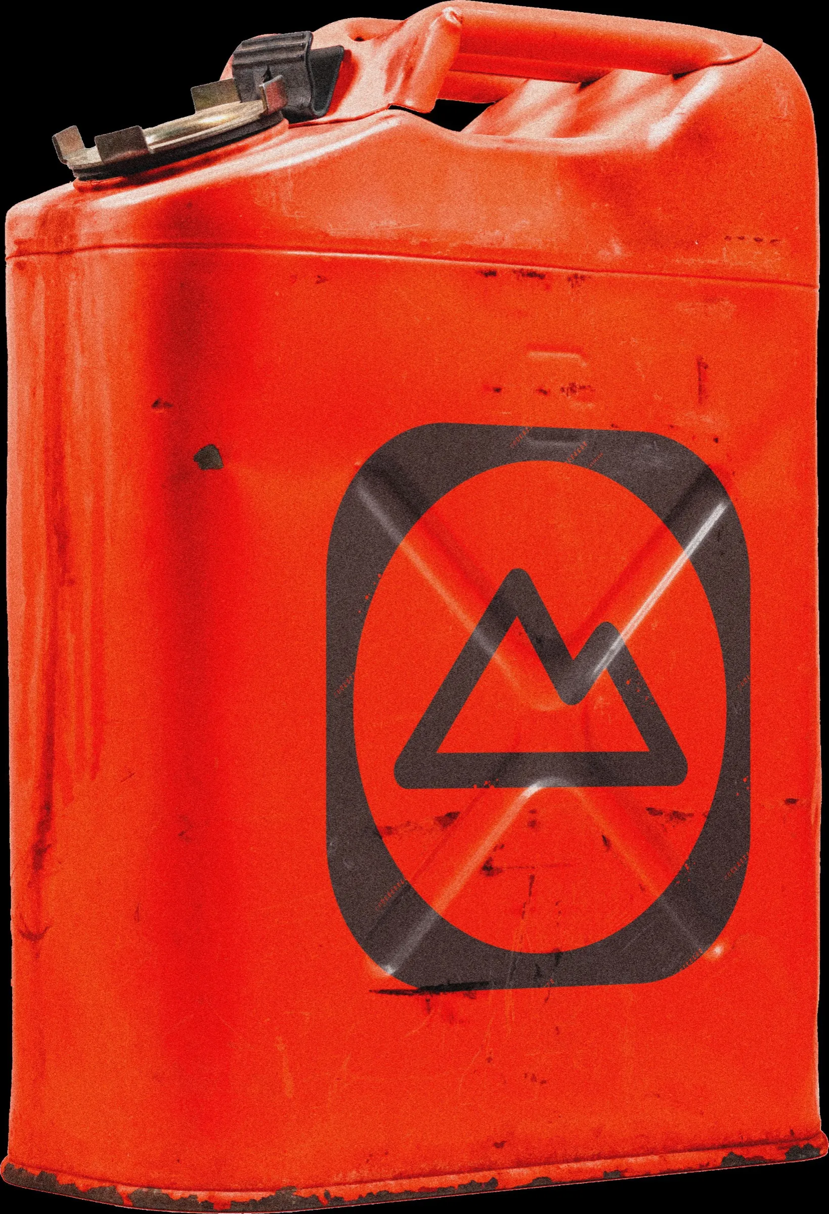
Overland TravelFIG. 04 / 15
Overland Travel · 2025Aerial view of two trucks in the dunes
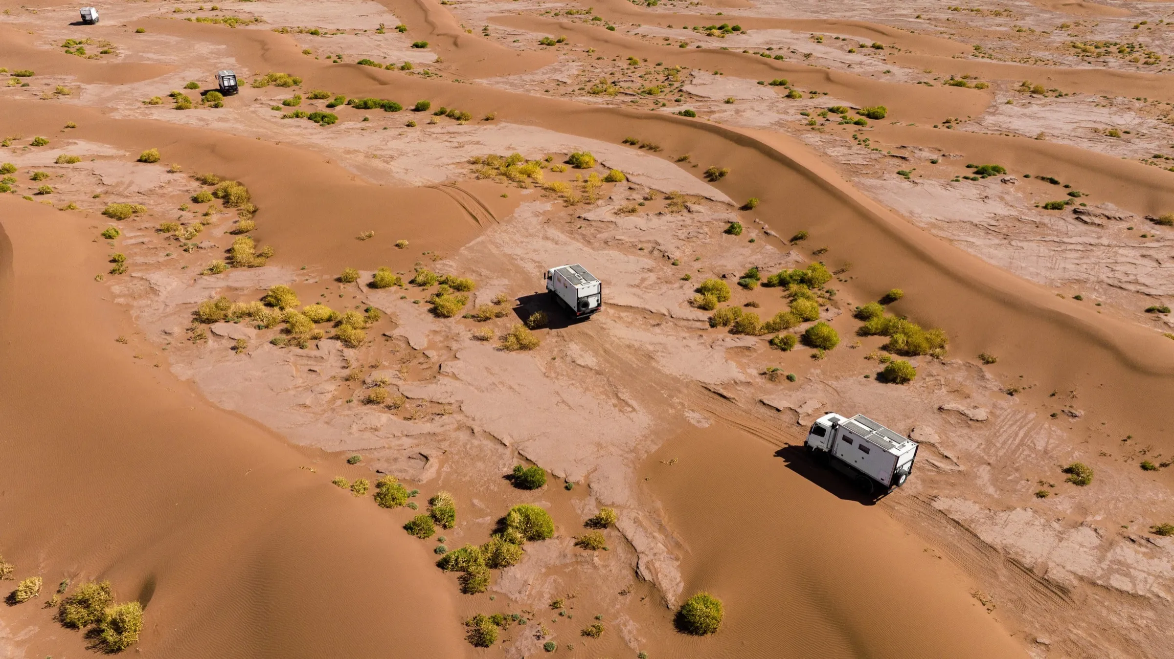
Overland TravelFIG. 05 / 15
Overland Travel · 2025Icon set on the truck
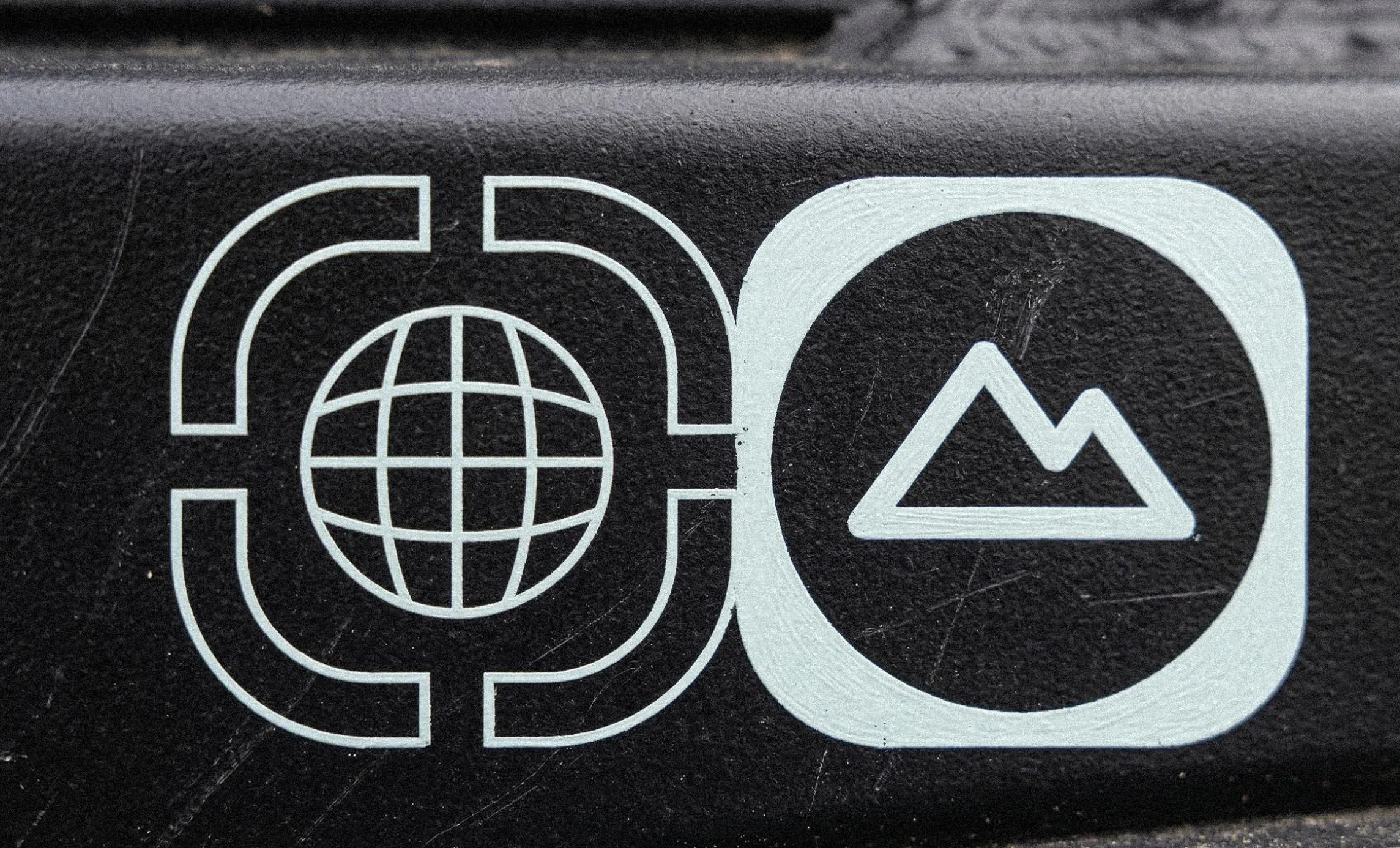
Overland TravelFIG. 06 / 15
Overland Travel · 2025Weathered logo after the trip
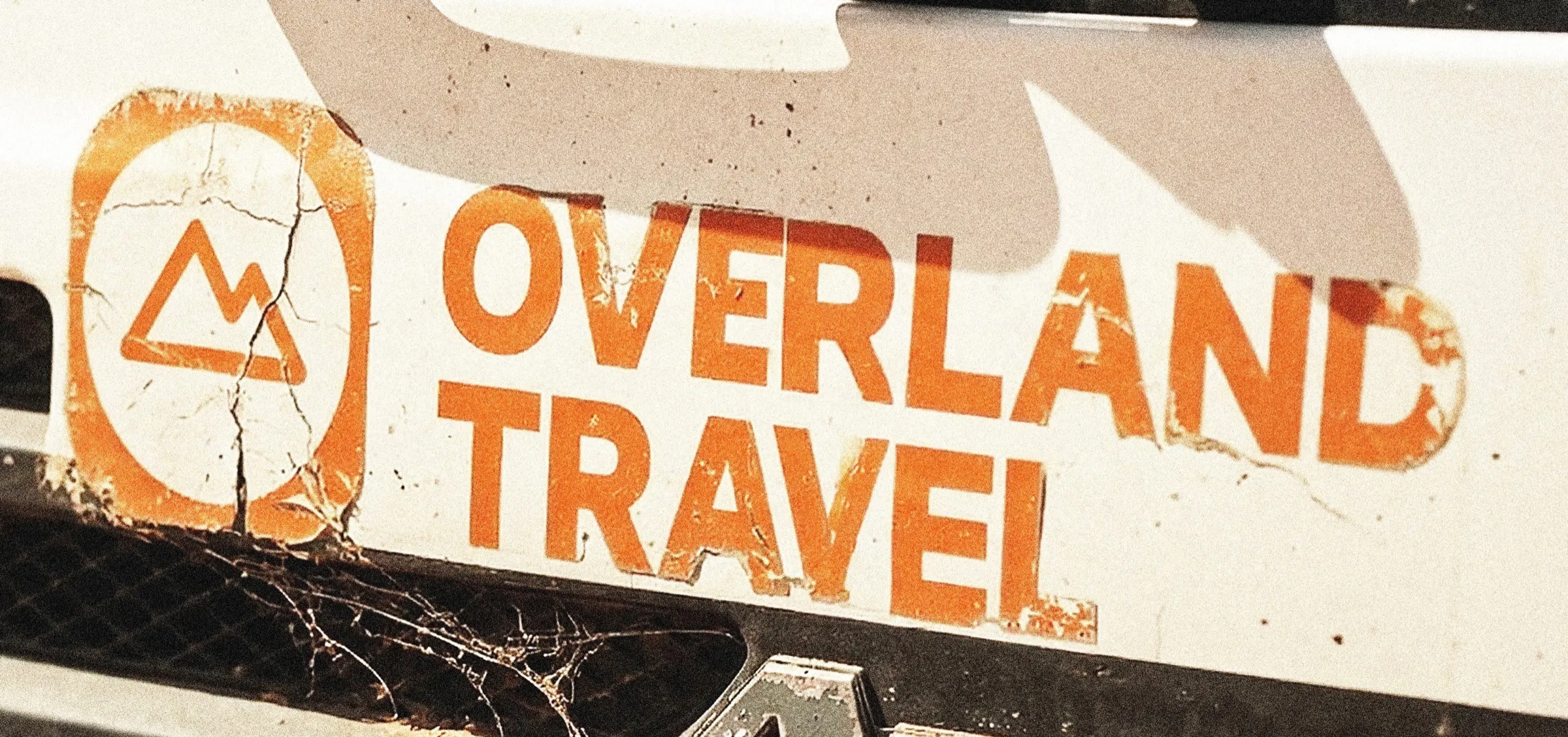
Overland TravelFIG. 07 / 15
Overland Travel · 2025Website on a laptop
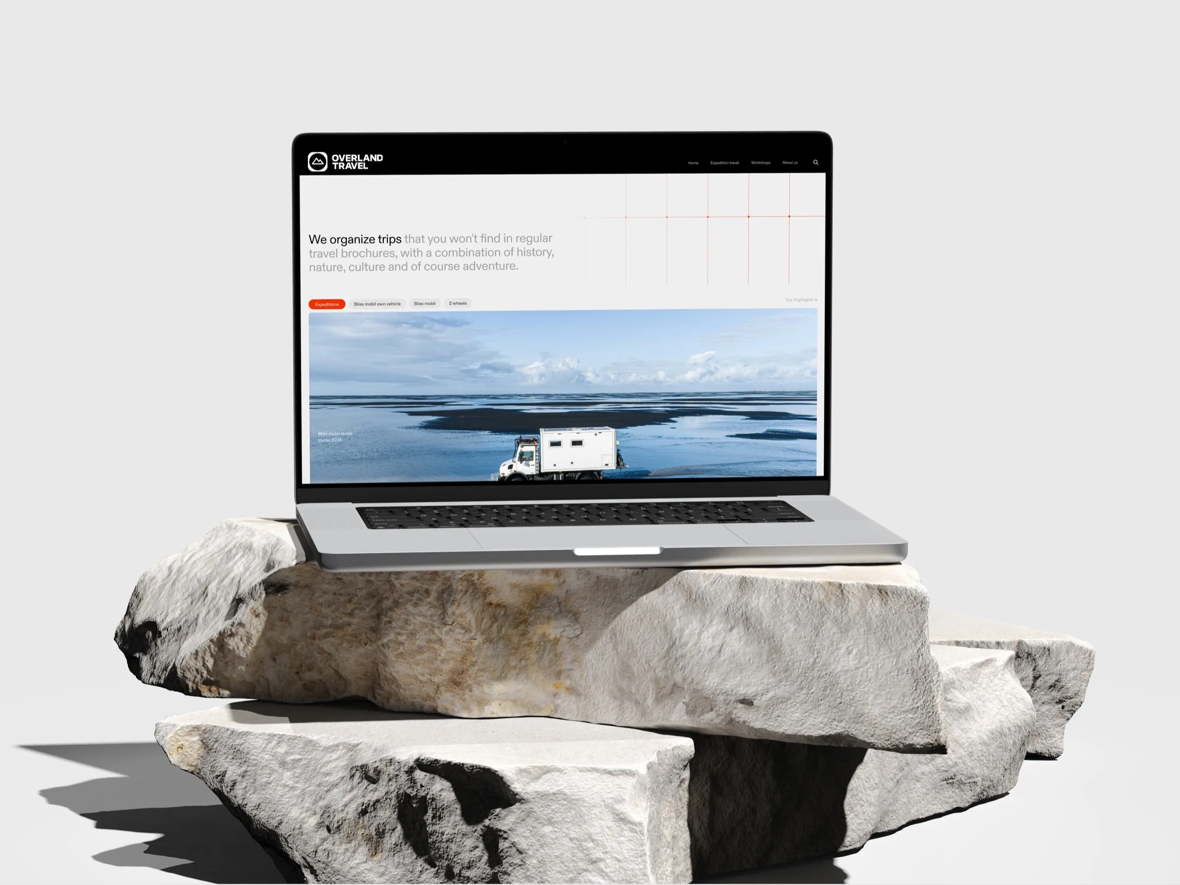
Overland TravelFIG. 08 / 15
Overland Travel · 2025Shirt with the wordmark
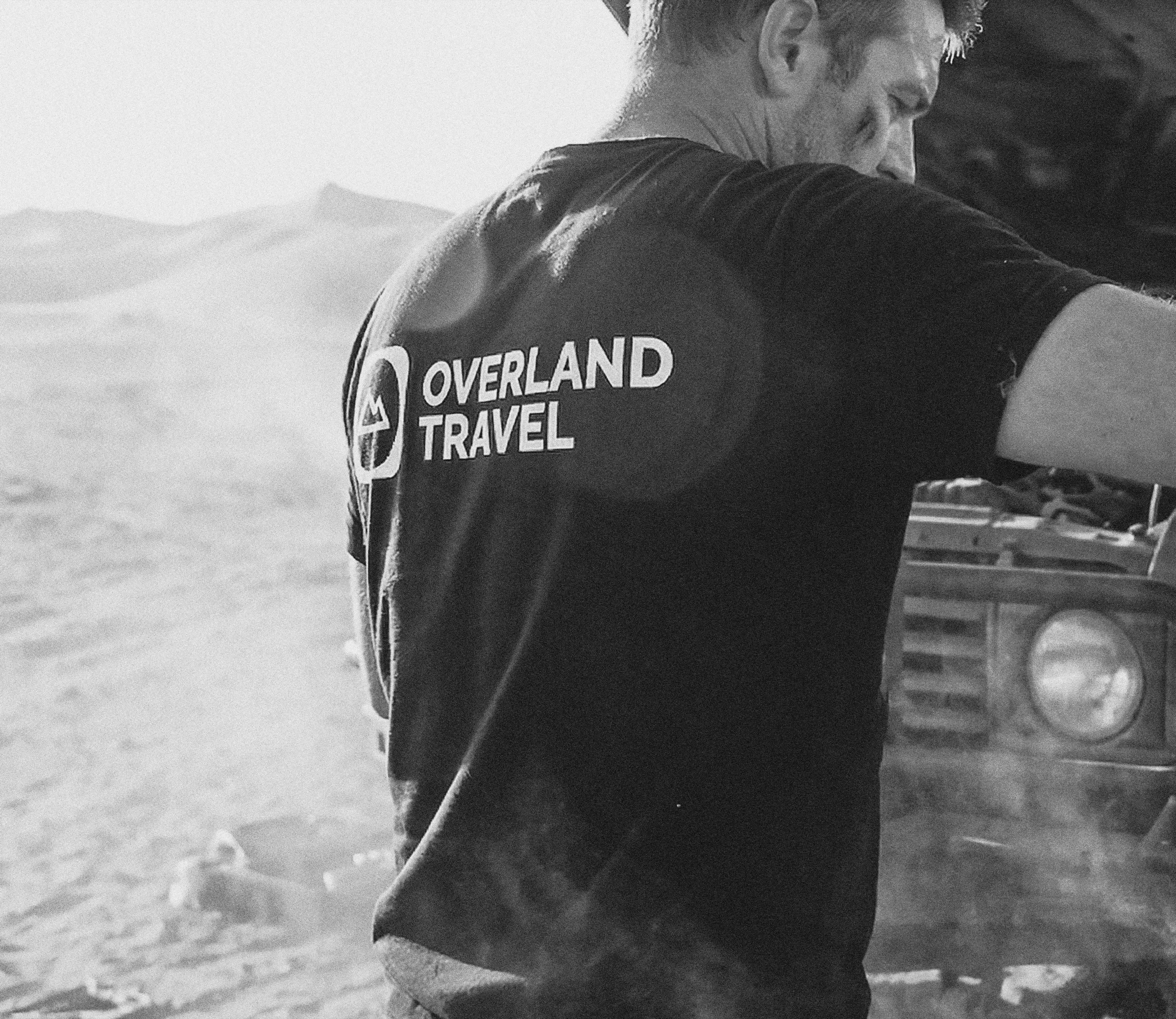
Overland TravelFIG. 09 / 15
Overland Travel · 2025Expedition stickers, Morocco and Iceland
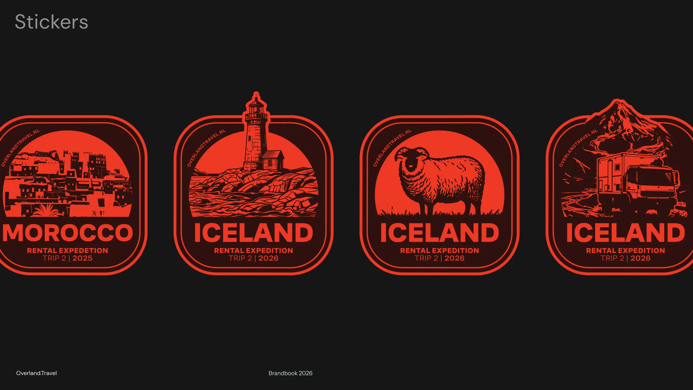
Overland TravelFIG. 10 / 15
Overland Travel · 2025Truck on a dirt road
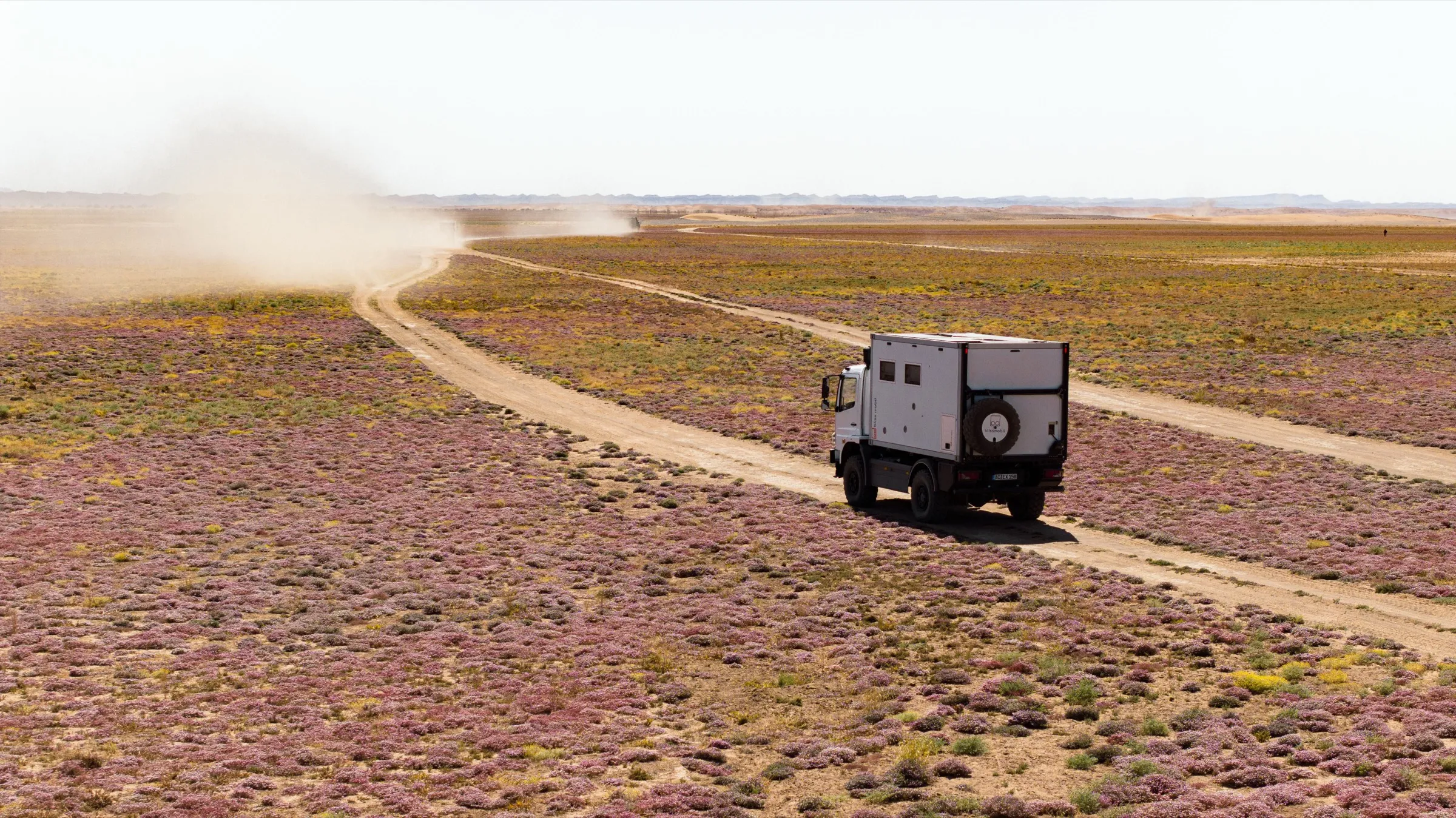
Overland TravelFIG. 11 / 15
Overland Travel · 2025The mountain emblem
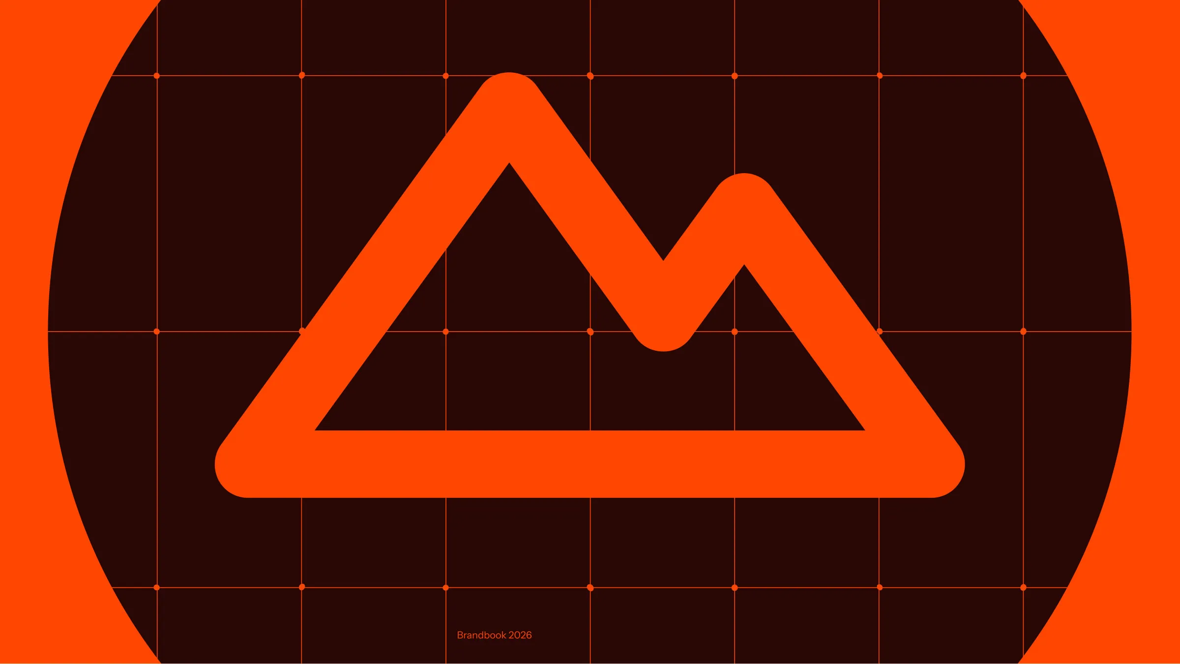
Overland TravelFIG. 12 / 15
Overland Travel · 2025A trip page on the website
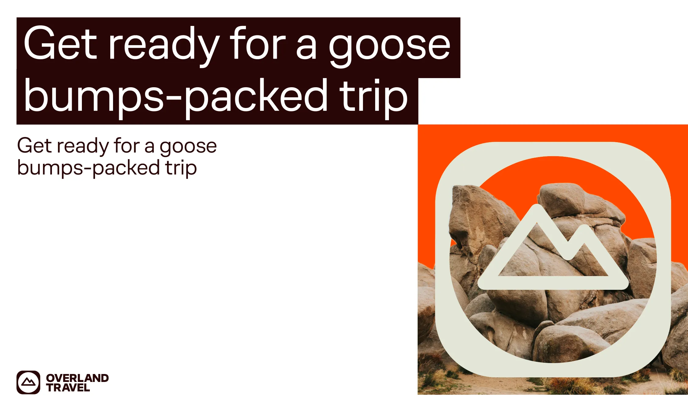
Overland TravelFIG. 13 / 15
Overland Travel · 2025The jacket
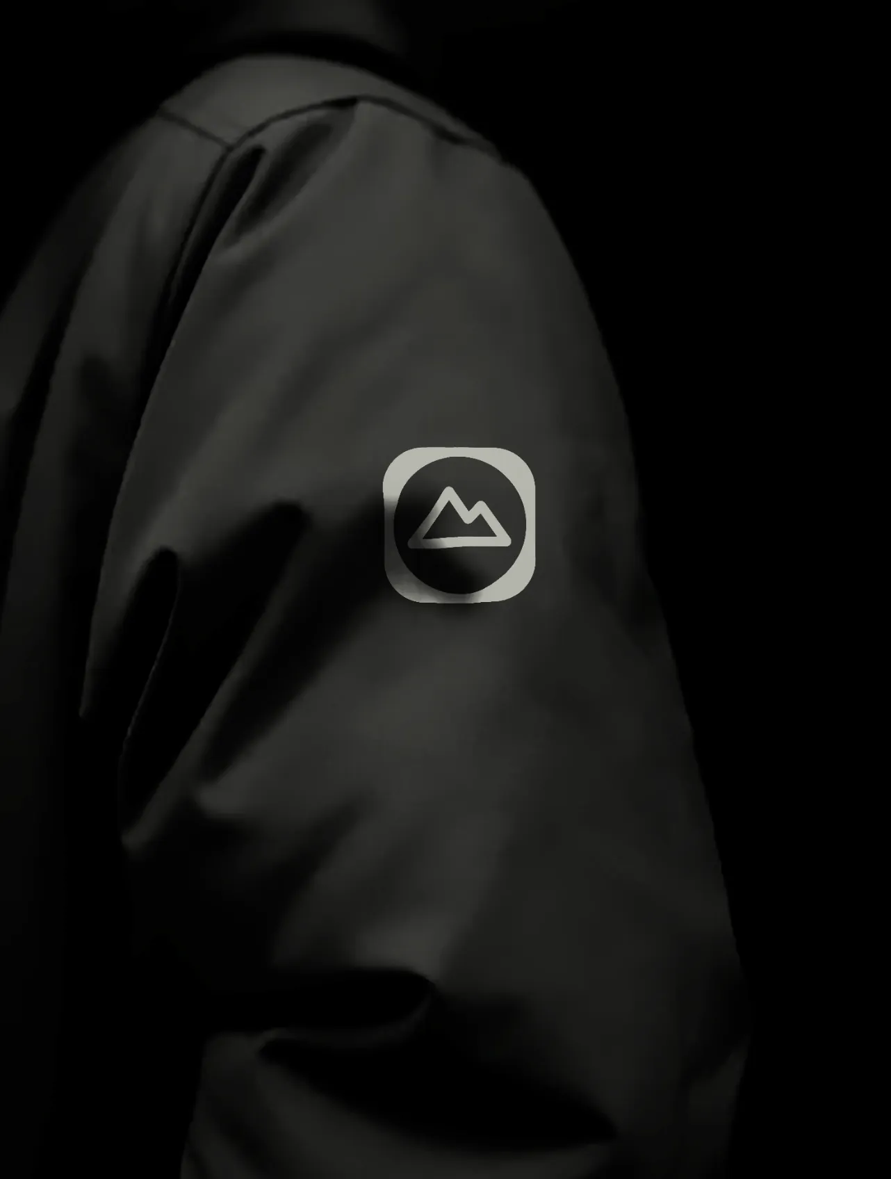
Overland TravelFIG. 14 / 15
Overland Travel · 2025The website
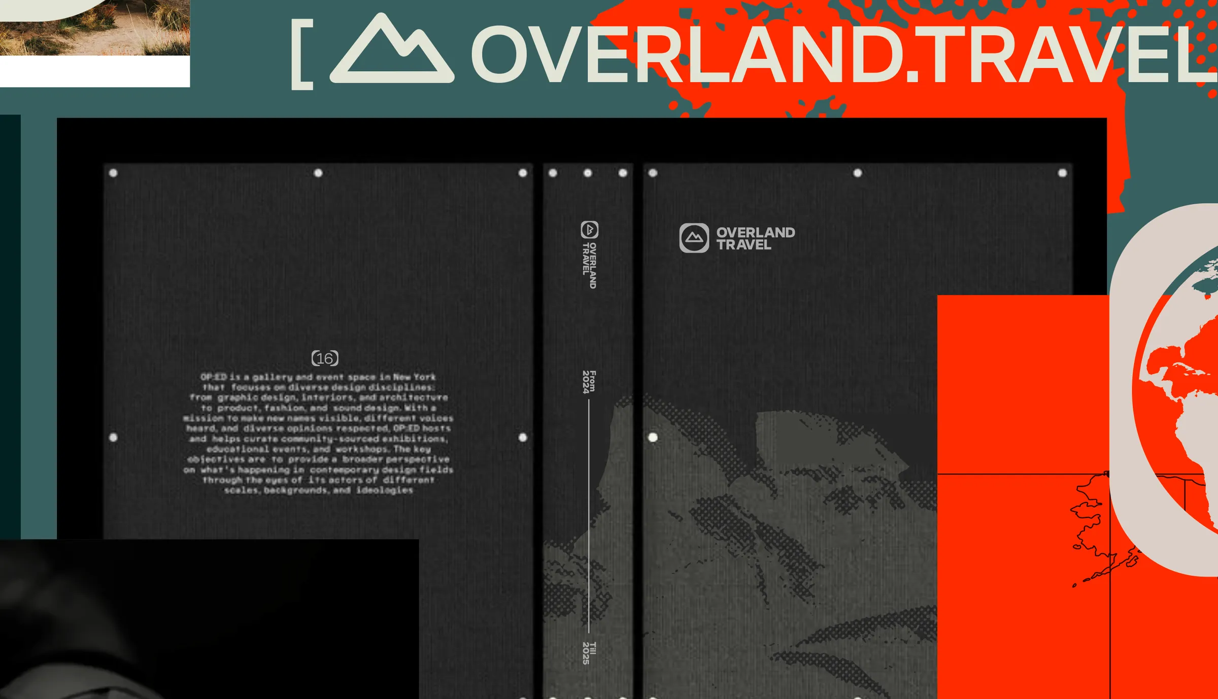
Overland TravelFIG. 15 / 15